Objective
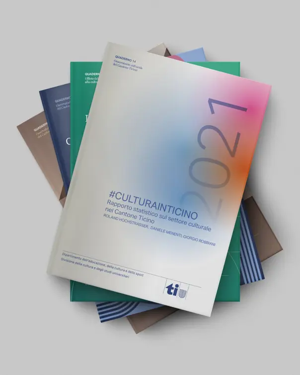
The Culture and University Studies Division’s “Notebooks” are one of the tools through which the Canton Ticino Department of Education, Culture and Sport fulfils its mission of research and dissemination. Making them easy to read, with a simple and inviting design, was our goal.
Visual identity
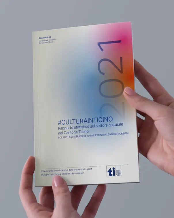
The play of different shades of a dominant colour becomes the key feature of the cover. Instead of photography, we chose pure graphic elements that echo 20th-century abstract traditions in the visual arts: based on elementary shapes, asymmetrical composition and generous negative space.
Graphic design
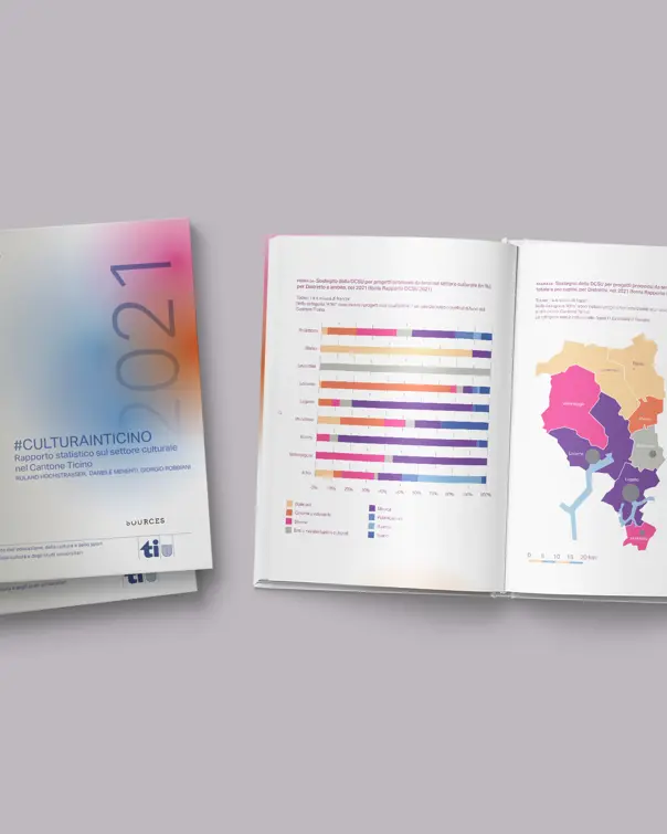
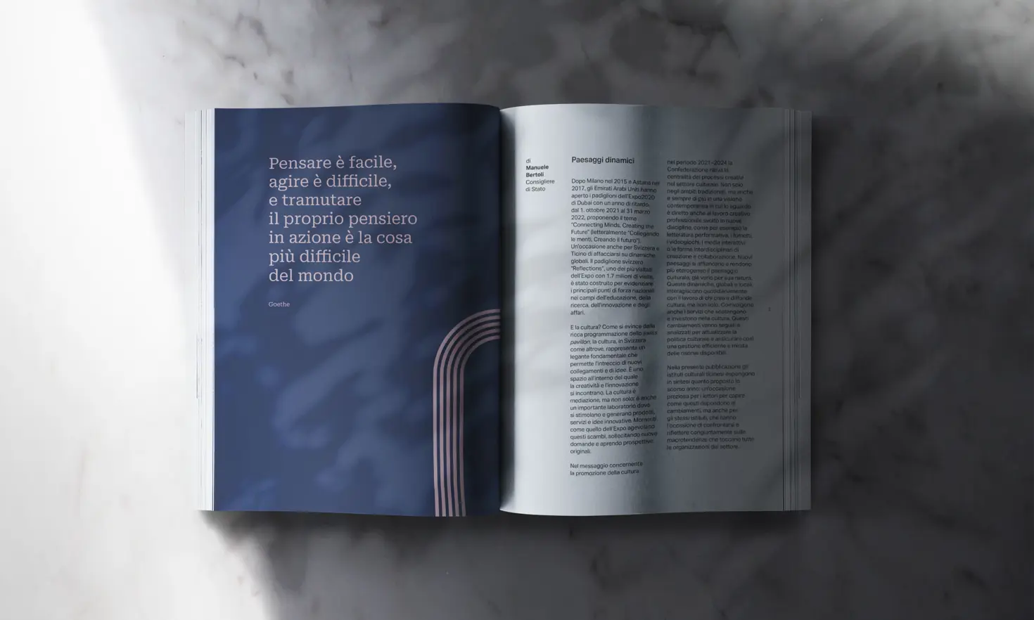
Two-column, non-justified text layout; a sans-serif font that’s easy to read; and short paragraphs separated by breathing space are stylistic choices that create a sense of balance and lightness for the reader. Monochrome graphic elements connect the sections, adding continuity while giving the reading room to breathe. They can also become a framing background when images appear on the page.