Context
The management of the water supply system of Locarno and several neighbouring municipalities (Losone and Muralto) was entrusted to a newly established municipal company: LEA – Locarnese Ente Acqua. How do you communicate to the public the value of this new corporate identity? That was the challenge we took on.
Logo & corporate design
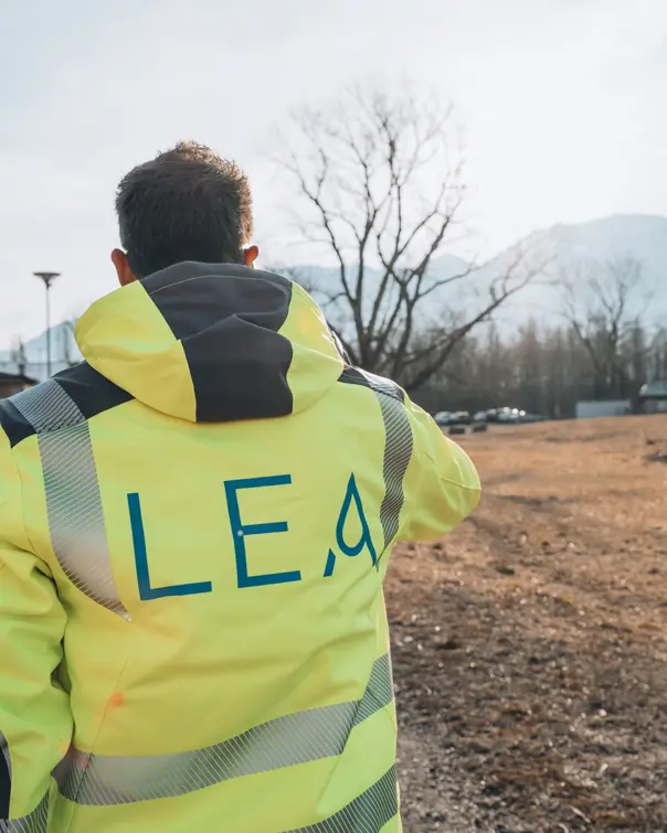
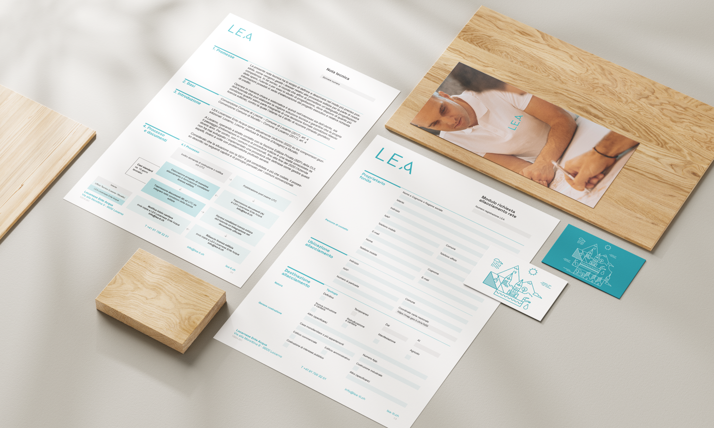
The logo is linked to the company acronym, using a light, elegant font where the “A” transforms into a water droplet.
Paired with the payoff “Locarnese in every drop”, it immediately conveys freshness and purity, as well as a strong connection to the territory.
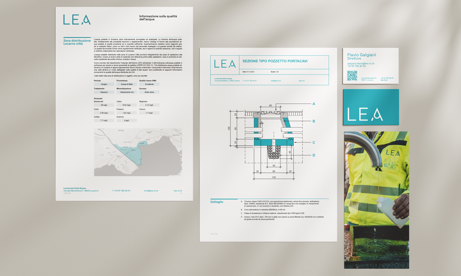
Starting from this concept, we developed the full corporate typography and the documents needed for internal and external communication.
The trademark was also registered at federal level.
Website & photo shoot
We created a functional website built around citizens’ user experience (connections, bills, etc.).
This approach — supported by sector experience — guided us in building a custom website on Umbraco CMS, designed to be expandable as the organisation grows.
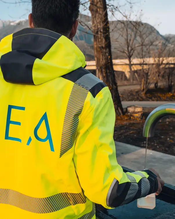
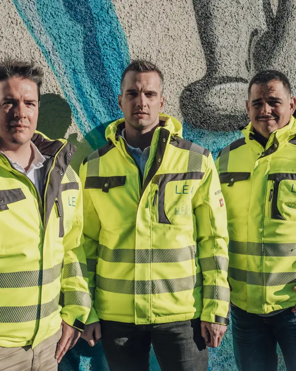
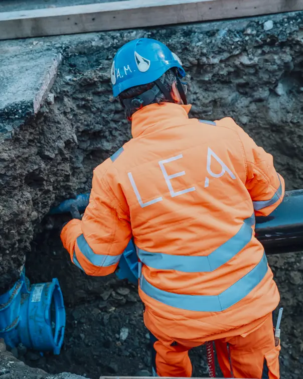
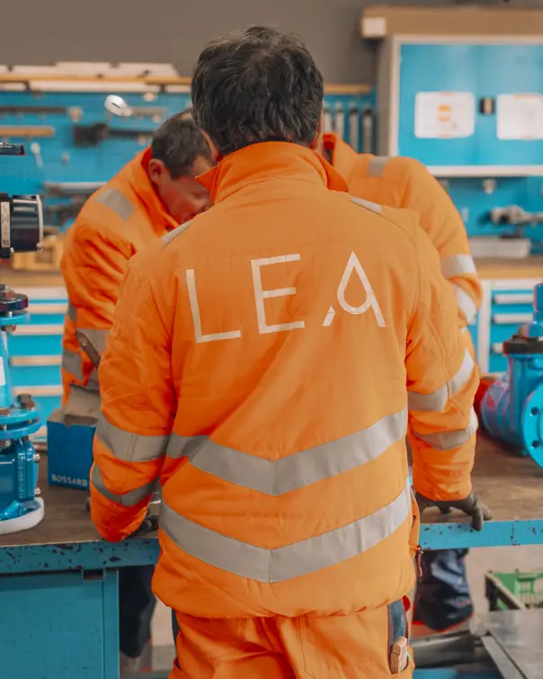
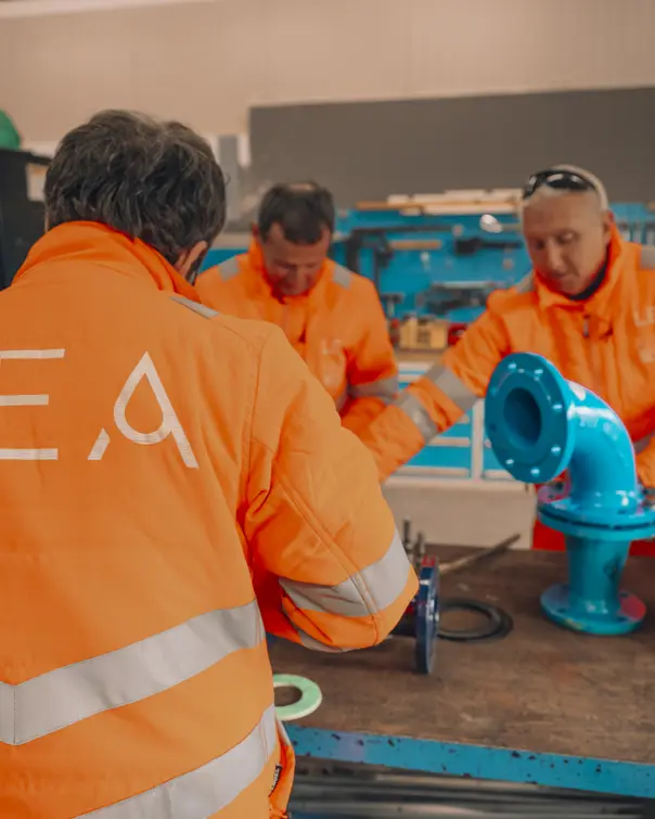
To communicate the reliability of a municipal company providing an essential service such as drinking water supply, we carried out a photo shoot that highlights the human and professional element behind LEA.